Institute of Public Accountants (IPA) Rebrand
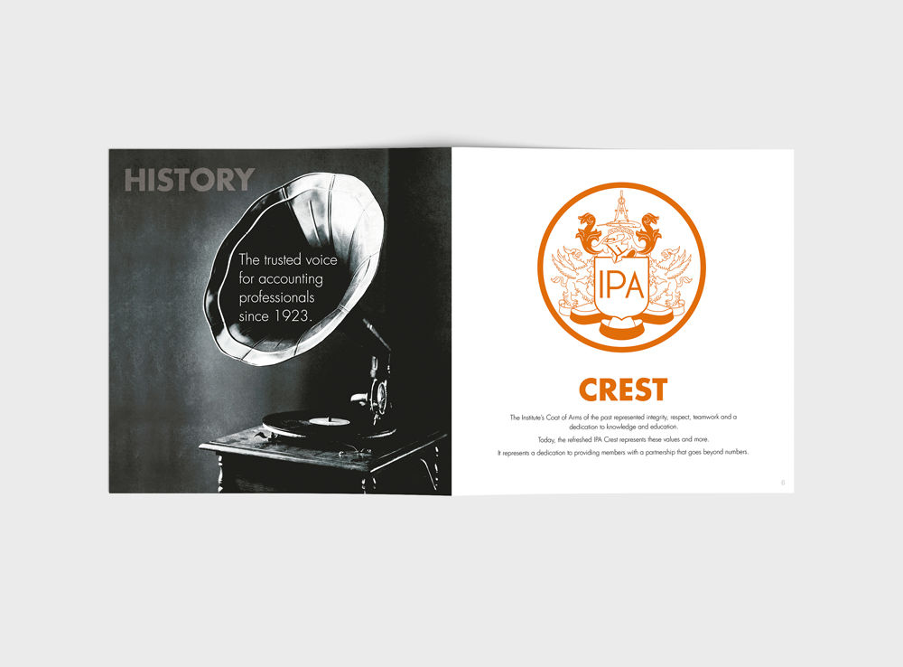
Rebranding from the National Institute of Accountants (NIA) to the Institute of Public Accountants (IPA), the brief was to incorporate the Institute’s coat of arms that portrays their proud heritage of representing the interests of members and the accounting profession for more than 90 years. The IPA’s identity also needed to have a modern feel to appeal to a younger target market.
A warm orange tone was applied to the refreshed IPA’s coat of arms which represents integrity, respect, teamwork and a dedication to knowledge and education. Accompanied with a modern grey coloured font for the type lock up. The colour orange was chosen to stand out from the crowd and competitors in addition to continually create a positive disturbance in the marketplace.
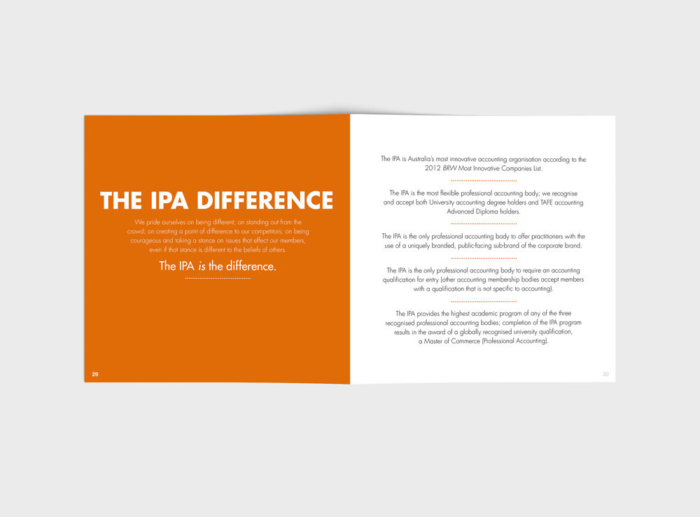
To strengthen their new identity, I created a beautifully designed brand book that captured the essence of the IPA brand through spectacular imagery. They wanted a representation of who they are, what they strive for, what they look like and where they want to be.
They knew their brand – it was consistent with their attitude, beliefs and emotions. It was professional and progressive, with design elements and images evolving with time and trends.
The book was printed on a heavy paper and bound using large stitching.


